BLOG

COMMUNICATION TAILORED TO MOBILE USERS

The use of smart mobile phones has exceeded all predictions in recent years. In the past year, there were more than 6,4 billion (Statista, 2021), which represents 80% of the entire world population. The number of mobile users continues to grow and according to forecasts, the mobile phones of the year 2024 used already 7 billions of users.
Screen time

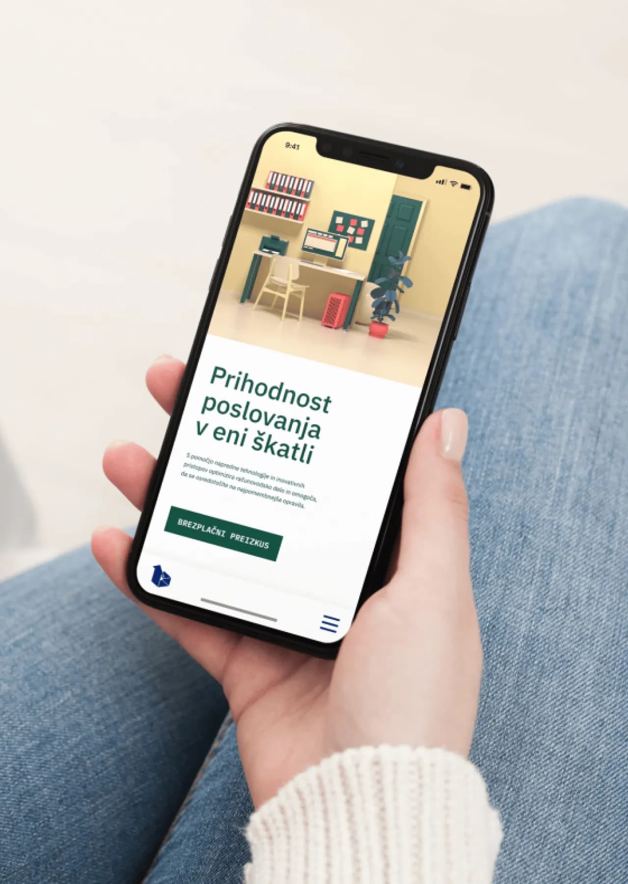
Information about the time we spend with a smartphone in hand is also important, because on average we use the phone 4-5 hours a day. With this, we have already 2019 exceeded the time we spend watching TV screens.

The conversion rate on mobile devices is 64% higher compared to the average rate on desktop devices. computers.

The above data confronts us with the inevitable fact that our users spend a considerable part of their time on their smartphone.

Communicating with users is a challenge

Aware of the extent of mobile phone use among users, companies will have to adapt their approach to communicating with the target group if they want to retain users and acquire new ones. With this, we especially appeal to the younger generation (Z), which is increasingly gaining in purchasing power, but at the same time we must not neglect the fact of the influence they have on the purchasing decisions of their own and older generations.

If we focus on online communication with our users, one such challenge will be mobile-first approach.

What does a mobile-first approach mean?

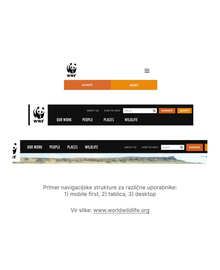
We distinguish between a mobile-first website and a responsive website. In Slovenia, we mainly see responsive sites, which means that the same amount of information that is on a desktop website is adapted to be displayed on a mobile device.

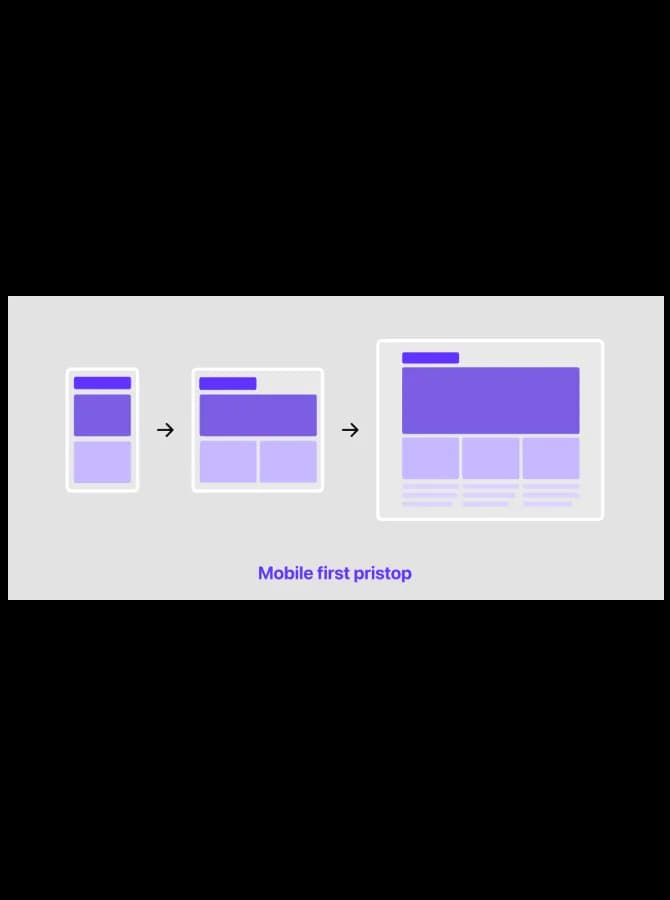
The mobile-first approach is about preparing the user experience for the mobile user, because only the mobile user has different needs. Then, according to other screens (tablet and desktop), functionalities are added.

What this means in practice

When designing the user experience for mobile user is necessary in put the content in the first row, because the user came to the page with the need for certain information and is not interested in "unnecessary" graphic accessories and video content. On the desktop version, such content is still very welcome.

To make it easier to imagine, let's try to imagine that we want to fit the furniture we have in a large house into a studio apartment. In a house, a large kitchen is an excellent choice, but in a studio it will be completely useless.

Key factors to pay attention to:

1. Navigation.

The user navigates on the phone with his fingers, which means that the upper part of the screen (red area) is harder for him to reach and will use more energy for this. Therefore, it is important to place key action elements such as the search engine, menu, CTA buttons, shopping cart in the green area, as access to it is much easier. Nobody wants the user to be unable to access the cart or complete the purchase.

Scheme: display of accessibility zones on the phone with a finger

2. Less is more.

With mobile first websites, we avoid complex graphics and large photos for two reasons: they slow down the page and take up very limited screen space. A one-second longer page load results in an average of 7% conversion loss.

Therefore, when planning and designing, it is necessary to ask whether a beautiful image has sufficient added value at the expense of the loss conversions.

3. 

Where possible, we use functionalities enabled by smart phones and facilitate actions for users. Such an example is e.g. using the camera to scan the card when paying.

User-oriented communication

At the forefront of online communication in 2022 we place the provision of a pleasant user experience. The mobile version of the website will almost certainly become your first point of contact with users in the future, as most users nowadays carry a phone in their pocket. The mobile experience is so seamless.

When creating a mobile user experience, we must not just be satisfied with meeting the basic parameters, but actually respond to the user's intent when they visit the page.

Using such an approach will not only make life easier for your users, but also for you, because at the end of the day we are all users.


Let's
create
something great together

(or call: 01 620 3370)

Contact

Fill in the form and briefly tell us what you have in mind. A member of the ENKI team will get back to you soon. Talk to you soon!